


Hell Energy Drink:
Hell Energy brand was founded in 2006 in Hungary. Established by Hungarian entrepreneurs, this energy drink brand has gained a substantial international market share since its inception. The energy drinks offered by Hell Energy are specifically designed for the brand's dynamic and youthful target audience.
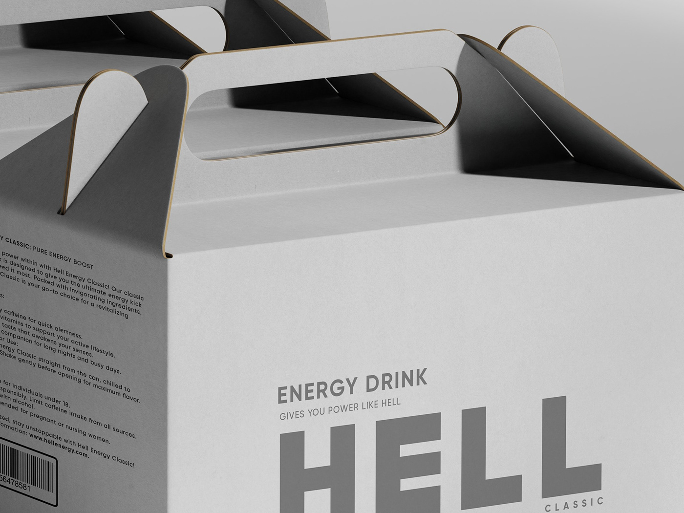
Packaging is chosen with minimal color and design. To add movement to cool colors, an illustrative character inspired by the brand name is featured.
Elevate your senses with the allure of minimalism and the intrigue of an illustrative dark sketch on this packaging.
Immerse yourself in the captivating essence of minimalism, heightened by the mysterious allure of an illustrative dark sketch that graces this sleek packaging. Unveil the perfect blend of simplicity and sophistication in every detail.


DESIGN INSPIRATION:
draw inspiration from the design.
This picture used to hang on the wall of my room during a certain period. Every time I looked at it, I would experience different and mysterious feelings. It was like a different world, a different perspective. It reminded me exactly of that. When I started this project, I decided to digitize the picture. It felt like Hell, it was the actual essence of the image. Presenting the message in a more comprehensive and minimalist form without logos and other distracting elements was an opportunity.
Diverging from the previous design, we've decided to pursue a more minimal and message-oriented approach, embracing a clean aesthetic.
The success of the design is directly proportional to its level of minimalism. To exemplify this in the simplest terms, amidst competitors, our product will stand out more, drawing attention with a clean appearance.
The key element accentuating the design is the choice of illustration. Opting for a darkness mind, like hell (naming), we aimed for a visual that is not only simple but also carries a profound message.
To maintain a light and uncluttered design, we strived to keep the typography minimal and straightforward. The circles at the back of the text are symmetrically placed, symbolizing unity, convergence, and the harmonious blending of two distinct worlds. In terms of color, we opted for two different tones: dark gray and off-white. These two colors were adapted to represent two different beverage variants.
One of the most distinctive features of the design is the product's 360-degree packaging. This technique provides us with unique advantages in a minimalistic design. By utilizing three different directions on the shelf, we have the opportunity to elevate our brand prominence. This strategic use of a 360-degree packaging design allows us to showcase our brand from multiple angles, creating a compelling visual impact.
.


